Anthony Dillon
on 7 May 2019
Web and Design team summary – 7 May 2019
This was a fairly busy two weeks for the Web & design team at Canonical. Here are some of the highlights of our completed work.
Web
Web is the squad that develop and maintain most of the brochure websites across the Canonical.
Supported the 19.04 release

We updated the websites for 19.04 and added a new takeover for it.
Design for new multipass website
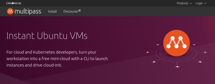
The multipass website has been designed and developed. It is now live at https://multipass.run.
Robotics on blog
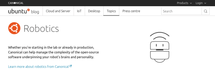
Add robotics top to the blog with a dedicated Robotics page. Also added the ability to subscribe to robotics newsletter. With an additional call to action banner at the bottom of robotics pages. If this performs well we will consider applying a similar model to other topics.
Progressed on UX & visual for customising Discourse
After some feedback and iterations, the design has been polished. The main consideration was the navigation with some tidying up of the topics list.
Brand
Brand squad champion a consistent look and feel across all media from web to social to print and logos.
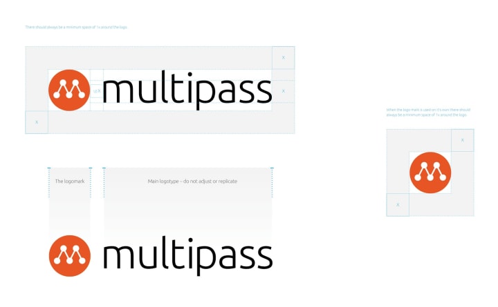
Multipass logo
We designed and developed the new Multipass logo and supported the web team with the website development including the creation of graphics
OpenStack Denver event
We supported the Marketing team in creating the stand for the ODS event in Denver, which included stand graphics and a bespoke changing room for attendees to change into Ubuntu polo shirts. As well as creating a sweet party invite for an evening event we ran.

Event screen animations
We carried on the work we have been doing with the new slide decks to create a looping animation to be played on the stand in Denver.
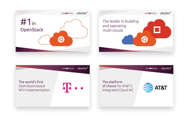
Whitepapers
In collaboration with the Marketing team, we created a number of whitepapers for use on the website.

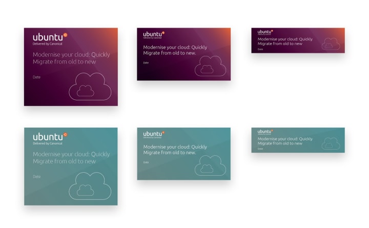
Title cards
We created editable Title card templates for the Marketing team, allowing them to get messages out to various media streams quickly with a consistent brand feel.
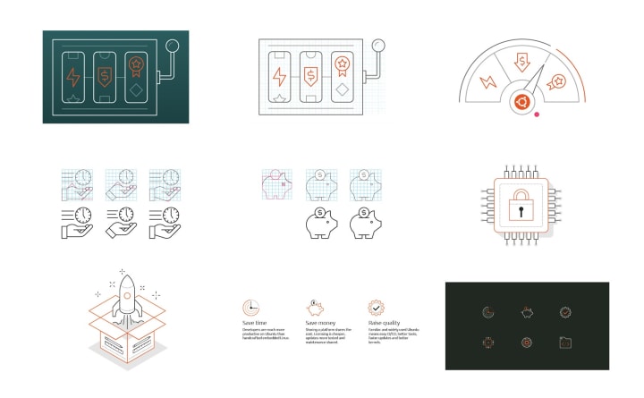
Refining the illustration style
This is an ongoing project we’re working hard on, to refine and develop our illustration style. We’ll be carrying on with it in the next few iterations and be creating some cool content for the various squads to use. Here’s a sneak peak of some work-in-progress…
MAAS
The MAAS squad develop the UI for the maas project.
Machine list has a new group-by view control
The team have been working on a feature that groups the machine listing view into logical groups. Machines can now be grouped by user (machine owner), and status (lifecycle status)
We now allow users to select some or all in a group to apply actions too. WIth useful counts to help you know what you have selected at a glance.
Accordion style controls to open and collapse groups to fit more information on the screen that you are interested in.

Add note to machine via the configuration
You can now add a note to a machine via the machine’s configuration UI. The note appears in the machine listing row.
JAAS
The JAAS squad develops the UI for the JAAS store and Juju GUI projects.
The team updated the content of JAAS.ai to align with jujucharms.com in preparation of the release; including modifications on the grid and typography according to the new Vanilla 2.0.
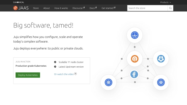
We also worked on updating the styling of search results pages, with the new label system to highlight what series the charms support.

We concluded the iteration with other related work on jaas.ai, adding a sitemap, updating the cards for charms, and resolving several responsive bugs.
Vanilla
The Vanilla squad design and maintain the design system and Vanilla framework library. They ensure a consistent style throughout web assets.
Sketch Master File 2.0
This iteration we updated the master sketch file based on our proposed Vanilla Framework 2.0 release, making sure all designed components were aligned to build, and that deprecated components were removed from the file.
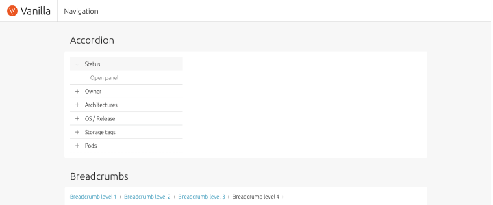
releases.ubuntu.com homepage
The final part of the project to update the Ubuntu releases site was a custom homepage template. This is now live with all other updated pages.

Fix outstanding 2.0 bugs
With the release of Vanilla Framework 2.0 becoming imminent, we wanted to ensure that all bugs and features that we had planned to include in the release were addressed. This included documentation updates for forms and spacing variables and tweaks to the spacing around tab strips.
Snapcraft
The Snapcraft team work closely with the snap store team to develop and maintain the snap store website.
Publishing your first snap
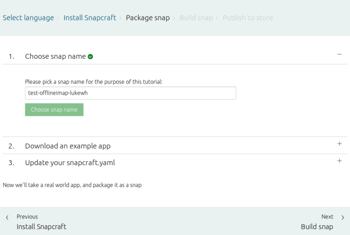
We’ve been using metrics to inform experimentation with the first snap flow to reduce friction of publishers getting their first snap created and uploaded to the store. Look out for more guidance, less switching between the browser and CLI, and less cluttered pages.
Featured banners for the Store
It’s no good having a snap if nobody uses it. To help we’ve implemented the ability to upload a banner image. Having a banner image will increase your chances of being featured on the store and – in the future – the desktop Snap Store. More on this in coming weeks.
The future of build.snapcraft.io
Another friction point for publishers is the separation of build.snapcraft.io and snapcraft.io services. We’ve started preliminary work to bring Build under the snapcraft.io umbrella. While it’s early days this is an exciting opportunity to improve the auto-build service while giving deeper snap information to publishers on snapcraft.io.
Blog posts
Formatting our code with Prettier – Barry McGee


