Anthony Dillon
on 23 September 2022
The Web and design team at Canonical runs in two-week iterations building and maintaining all of the Canonical websites and product web interfaces. Here are some of the highlights of our completed work from this iteration.
Sites
The Web team develops and maintains most of Canonical’s sites like ubuntu.com, canonical.com and more.
Why OpenStack page
The why OpenStack page has been created and released in this iteration. On this page, you will be able to get an idea of why you need to use OpenStack. Also, you can find some case studies from across the industry.

Brand
The Brand team develop our design strategy and create the look and feel for the company across many touch-points, from web, documents, exhibitions, logos and video.
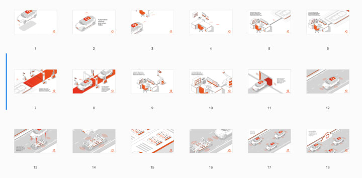
New storyboard for Automotive

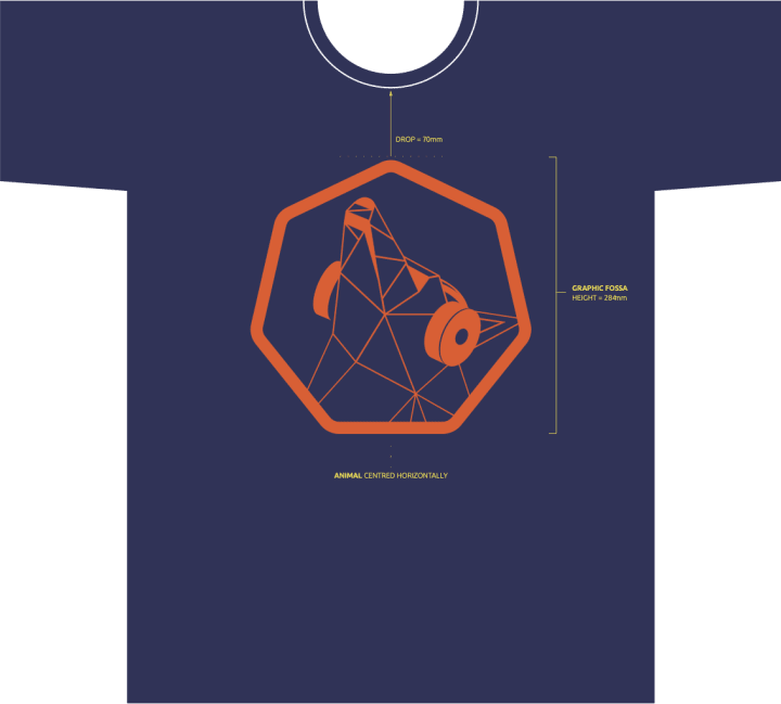
New campaign for Kubernetes

Ubuntu Summit logo

Commercial
The Commercial team maintains and develops all commercial service U’s provided by Canonical. Including the Ubuntu Advantage store and our CUE certification.
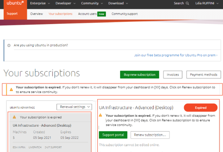
After introducing online renewals for Ubuntu Advantage subscriptions, we are now working on updating the Ubuntu Advantage dashboard to make it easier for users to find out the status of their subscriptions and how to renew them more easily. On top of information like expiry date or included services, the dashboard will also feature information on the available renewal options as well as the subscription renewal status. We are also working on upgrading our expiry notifications to facilitate the recovery of expired subscriptions.
MAAS
The MAAS team develops the UI for the MAAS project.
NVIDIA DPUs – Child-parent machines
The MAAS core engineering team has been working on the ability to support accelerators, with NVIDIA Bluefield 2 DPUs as a starting MVP. We want to expose these new SoCs in MAAS and the relationship with their host machine, which was not available by default.
That led us to understand that there was a more generic problem to solve: child-parent relationships between machines were not explicit and clear.
We defined the entire set of machines MAAS can show and how are their relationships reflected in the DB.
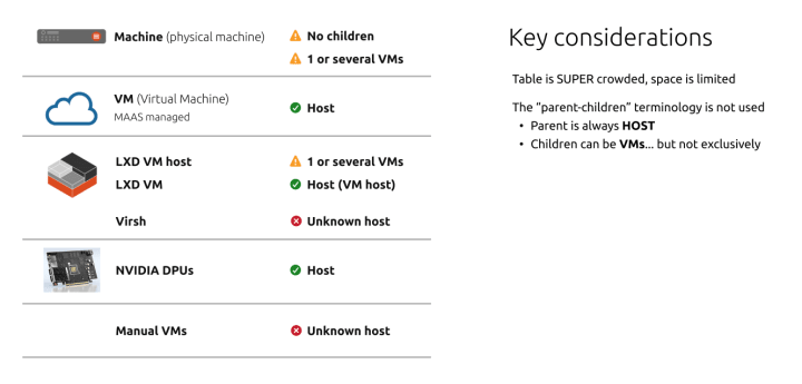
With that in mind, next iteration we will test the first wireframe and gather feedback from different users to refine our idea.
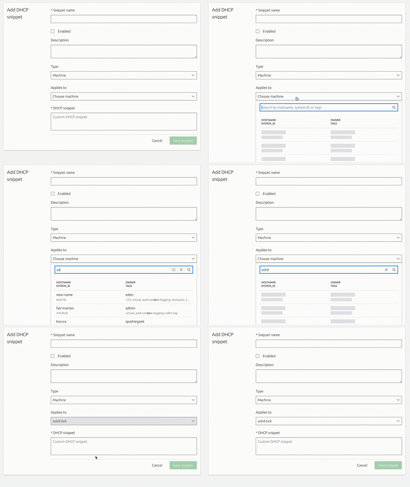
DHCP and Discovery forms with server-side machine search
We made progress in implementing the server-side machine filtering and integrated it with the DHCP and Discovery forms. Now, only the machines that are required for the particular view will be requested and can be searched more easily via the new list box UI component.
Cleaning up the node summary page
The node summary page is a core part of the MAAS UI – it shows the essential information a user may need to know about any given machine or controller. Showing this information in a clean and concise way is absolutely critical, and after many iterations, the design of the page was in need of some cleaning up.
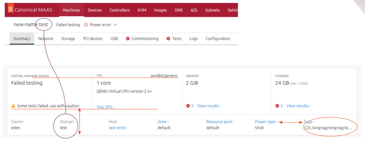
We made the decision to remove “Domain” from the bottom row, since this is already shown in the page header next to the node’s name. There’s also a lot of unused space in this row, which could be used to allow the tags assigned to a node to be displayed in full, rather than just being truncated. Some of the alignment of different components was off as well, and there was a lot of unnecessary vertical whitespace which could be gotten rid of to make the whole page a lot cleaner and more concise.
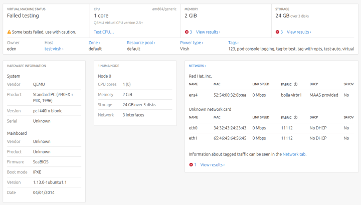
The bottom half of the page also had some issues. With all of the other text on the page being left-aligned, there was no reason to have the labels for hardware information and Numa nodes aligned to the centre. As with the overview card above, there is also a lot of vertical whitespace that isn’t needed, and the boot mode of the node also needed to be displayed.

A lot of back and forth between developers and visual designers was carried out in order to achieve the best possible look for the page, and you can see the final product below.
Design system
The Vanilla team designs and maintains the design system and Vanilla framework library. They ensure a consistent style throughout web assets.
New website homepage and main pages
In this iteration, we completed the work of designing and writing content for the main sections of the new design system website. These pages include resource pages with downloadable files for designers and developers; a page explaining how the public can contribute to our design system; a getting started guide; and the new homepage.
Accordion side navigation
We also continued work on expandable accordion side navigation, improving the code, polishing some edge cases and preparing it for release with the next version of Vanilla.

Marketplace
The Marketplace team works closely with the Store, Snapcraft, Snapd and Desktop teams to develop and maintain the Snap Store and Charmhub.
Snapcraft
Collaborator
As part of the Snapcraft dashboard migration to the core snapcraft website, we have completed the UX design for the collaborator role.
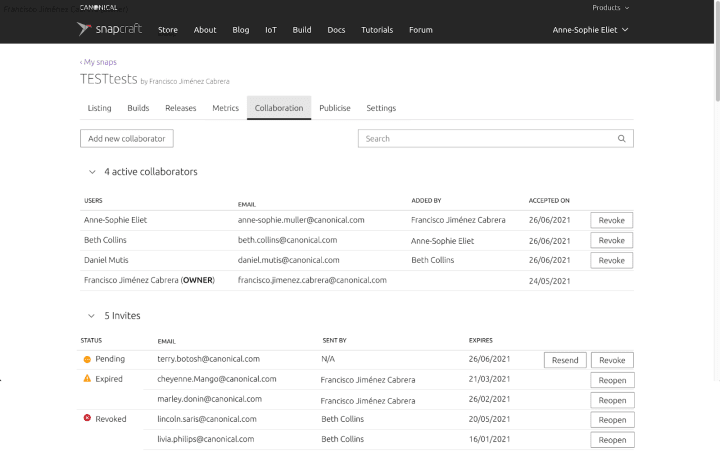
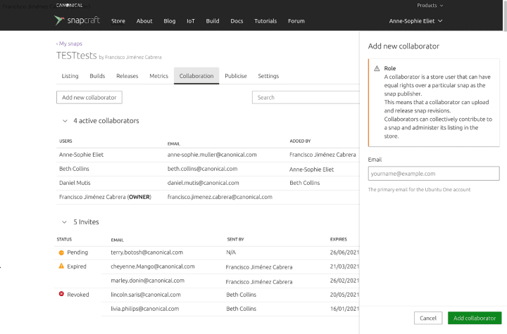
The visual design work is in progress.
Team posts:
- Automating React test migration from Enzyme to Testing Library by Nick De Villiers
We are hiring!
Come and join the team. If you would like to find out more about the team please read our blog and description of the team.
With ♥ from Canonical web team.


