Peter Mahnke
on 11 March 2022
The Web and design team at Canonical run two-week iterations building and maintaining all of the Canonical websites and product web interfaces. Here are some of the highlights of our completed work from this iteration.
Brand
The Brand team develop our design strategy and create the look and feel for the company across many touch-points, from web, documents, exhibitions, logos and video.
Webinar diagram support
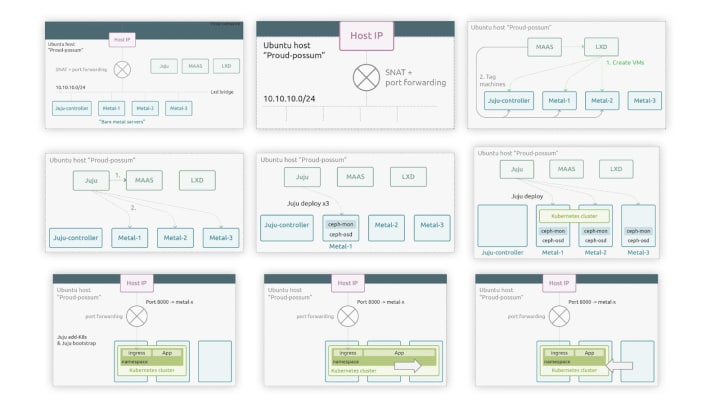
The product management teams for Kubernetes and MAAS have run a webinar on ‘Introduction to bare metal cloud’, for which we created a series of diagrams to help explain setting up a bare metal Kubernetes lab.
Marketing support
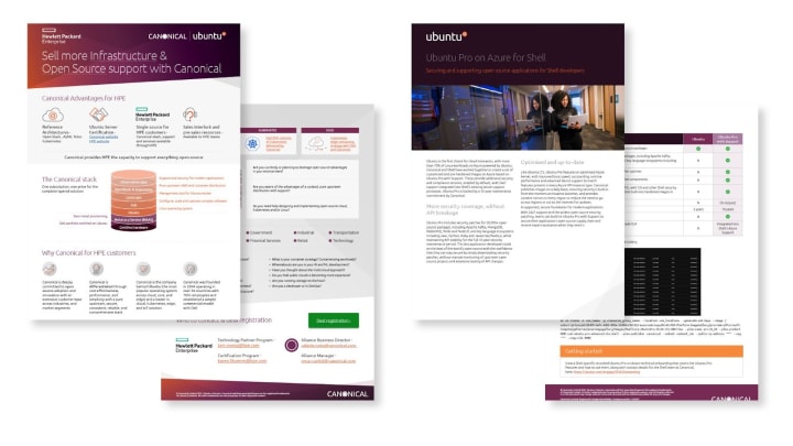
We created a number of documents for the Marketing and Sales teams in this iteration including white papers, datasheets and a HP battlecard for the teams to refer to.

Apps
The Apps team develops the UI for the MAAS project and the JAAS dashboard for the Juju project.
Updating hardware info post-deployment
Over the lifecycle of a deployed machine, its hardware configuration can change. Right now, any hardware change will not be reflected in MAAS without recommissioning and redeploying that machine. The MAAS team is working on a solution designed to keep the hardware state within MAAS up to date, which requires changes in the MAAS UI.
We still have some aspects to discuss and assumptions to confirm. What we are going to show here are only the first ideas in wireframes.
First of all, we need to provide the users with the option of periodically syncing the hardware configuration of a machine when it is deployed. The reason we don’t want to impose default behaviour is because we don’t want to intrude the experience for our users. Enabling HW synchronisation for some cases can introduce more problems.

The hardware update frequency will be a global setting.
After the deployment, new update information will appear in the machine details:
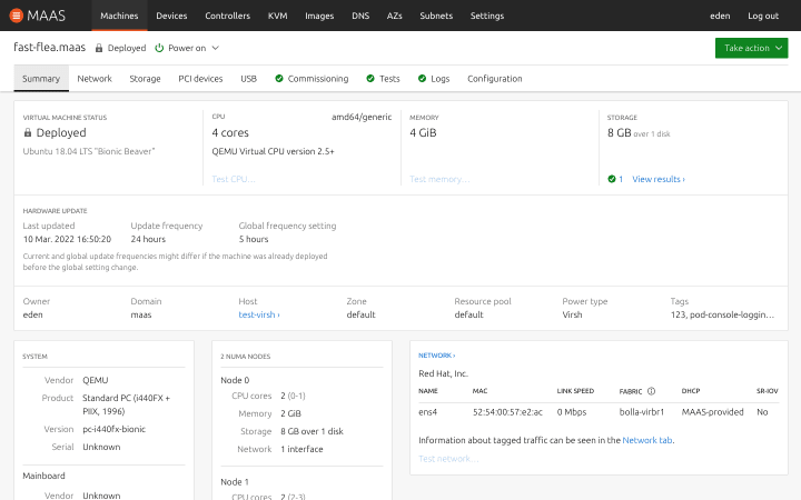
We will show relevant information about the hardware updates, like when was the configuration last updated, the hardware update frequency of this machine and the global setting, which might be different if it was changed after the deployment.
This is only the first wireframe and it has to go through a feedback process. We will share the final design in the next post.
MAAS UI performance
During the engineering sprint we wanted to work on something together with the API team to address these performance issues and come up with quick win solutions.
One solution we are exploring is for search, filtering, grouping, and pagination to be handled on the server side. This allows us to store and handle less data on the client side.

This hugely reduces the amount of data management and complexity in the front-end code, but also poses some challenges. Machines can be added or removed on the back-end at any time. How do we keep a live-updating UI with limited data set on the front end, and manage these updates in a way that’s useful and not disrupting for the user?
Updating the list automatically seemed less than ideal as it would often cause unexpected shifts in layout amongst other issues. That’s why we decided to display a notification as soon as any machines are added or removed and let the user reload the list.

Refresh list of results UI prototype
Tag management
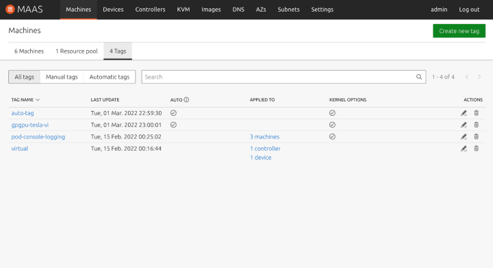
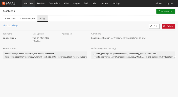
We have started building the UI for tag management. The tag listing page is now implemented, along with the tag details page. We’re expecting to work on the create, update, and deletion forms next.
Vanilla
The Vanilla team designs and maintains the design system and Vanilla framework library. They ensure a consistent style throughout web assets.
Frankfurt Sprint
Half the team spent a week in Frankfurt, which meant we were busy with a hackweek and other sprint activities, and not able to spend too much time on Vanilla. We did however find some time to write a blog post about the Live Demo Box proof of concept we implemented last iteration.
Hackweek – component class reference
While half the team attended a cross team conference in Frankfurt, we had a hackweek. We worked in small teams on a variety of projects. One of them was investigating a way to build a class reference table for component documentation from comments in the code.
We reviewed a couple different solutions and ended up using PostCSS to parse the comments out of Vanilla SCSS files and store some component metadata as a YAML file. Which is later transformed and rendered on the website a Flask template.
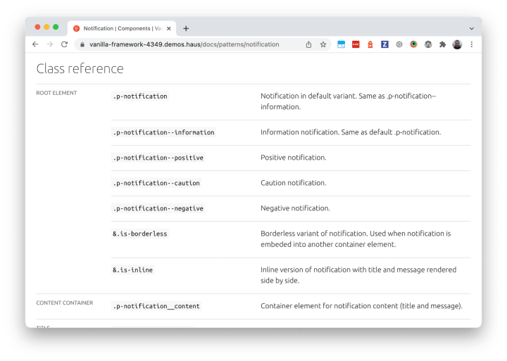
It was a quick and interesting project that we can use as a base to integrate it into the Vanilla website later after some polishing and refactoring.
Design system docs in Discourse
As part of the work on the new design system site we worked on connecting the current Vanilla website to the Ubuntu Discourse, where the design guidelines and specifications are being posted and maintained.
This way we will be able to show the content of the design documentation directly in the Vanilla documentation of relevant components or patterns.

Marketplace
The Marketplace team works closely with the Store team to develop and maintain the Snap Store site and the upcoming Charmhub site.
Frankfurt Sprint
Specification Tool
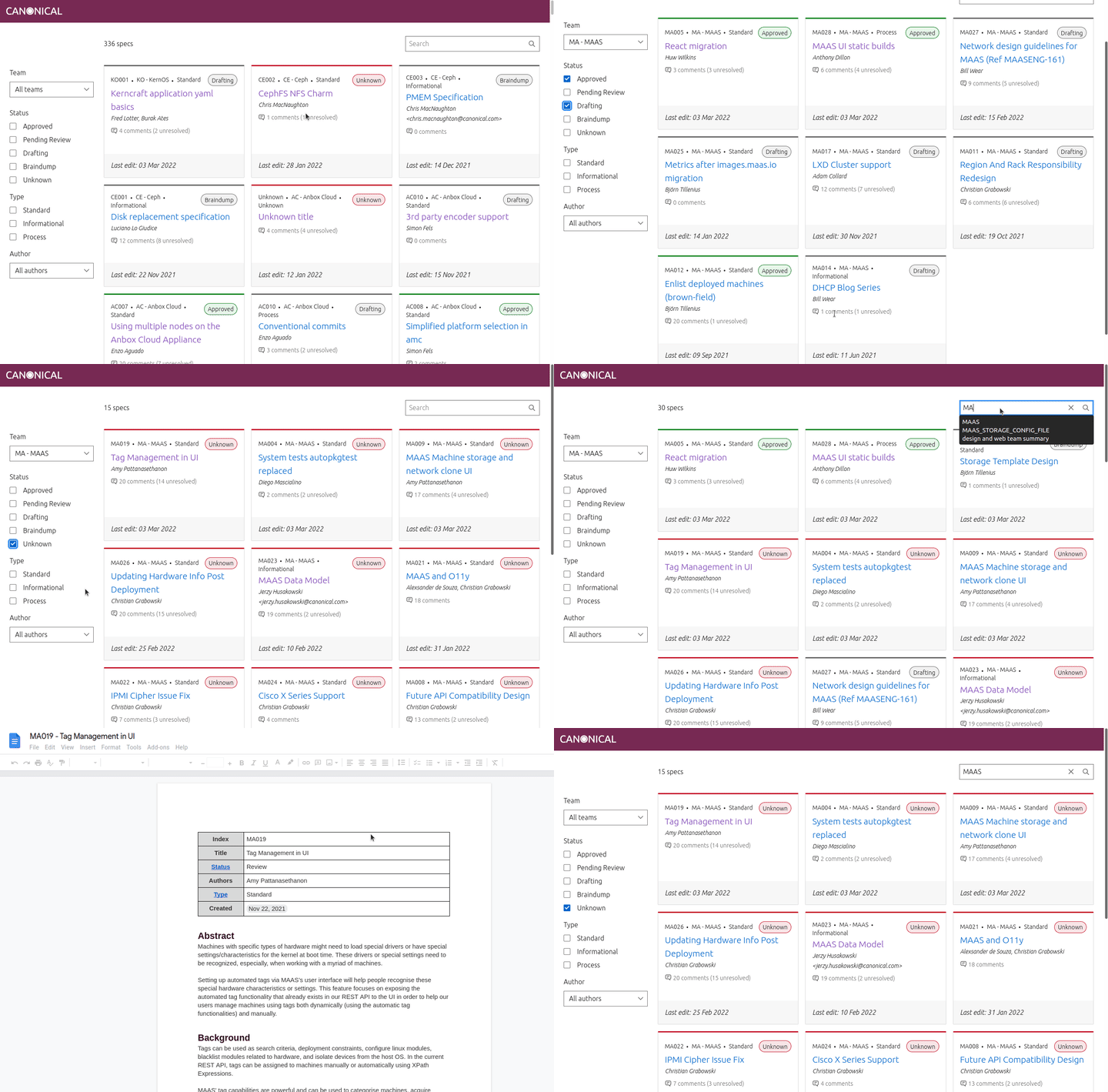
During the Frankfurt Sprint, part of the team worked on a specification tool in a hackathon style week.
The problem we wanted to solve is that there are a lot of feature/project specifications to agree across Canonical. They can sometimes be hard to find and understand the specs current status and life cycle. We discovered there were also inconsistencies in the way they are written.
We wanted to provide an interface that allows interested parties to view specs with all their metadata available through a single pane of glass. Drive consistency across the specs and encourage positive life cycle maintenance of the documents.
Topic pages are released on Charmhub
Discover topic pages in the homepage. This new section will display relevant topics to you based on your search and filters.

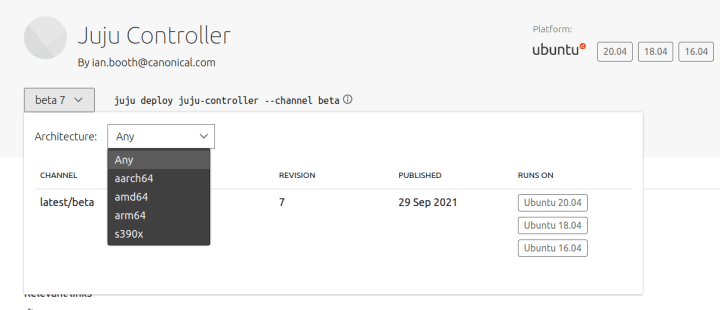
Filter by architecture
It is now possible to filter the different channels by architecture on a charm details page.
Snapcraft release UI visual updates and UX improvements
In order to make our snaps release process more intuitive and accessible we have done a lot of work around visual updates and UX improvements.
Prior to these updates the only way to release revisions and promote releases was by drag and drop which caused problems for users, especially on touch screens. Now there are buttons which allow users to perform these actions, along with better labelling which means hovering for a tooltip is no longer the only way to get information about a release.
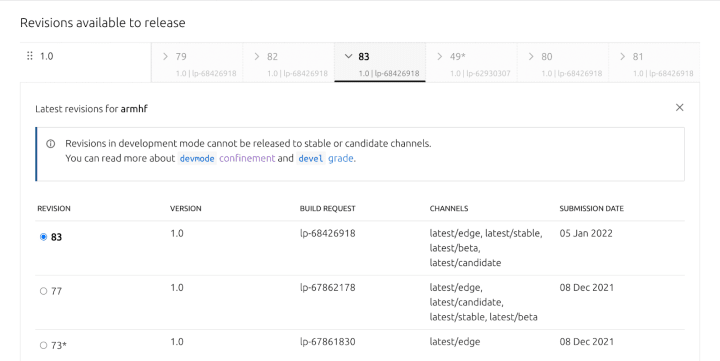
Screenshot of the revisions UI
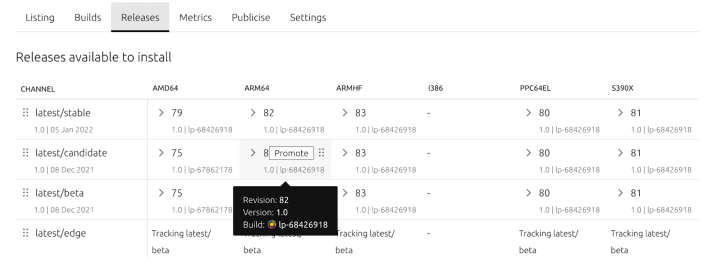
Screenshot of the releases UI
Team posts:
- Vanilla’s accessibility documentation process
- Accessible by design: How we are designing for accessibility at Canonical
We are hiring!
With ♥ from Canonical web team.


